OPTION 8 CREATIVE
ELLA GRAY Branding
Ella Gray Home+Gifts in the heart of downtown Kalama. Its clean, cozy vibe and feel of a modern loft apartment are traceable to urban places. Ella Gray is the antidote to click-and-ship shopping. More than home decor, the owner wants to offer an experience and inspiration!
Ella Gray needed branding to attract customers to their home and gift boutique in an up and coming area of Kalama. The store also provides more than just gifts and interior design, on the second floor there is a community table offering creative workshops.
Susan created a branding package that is warm and welcoming with a modern twist by using architectural elements from the portico of the original building in the brand icon. The logo typeface is hand drawn to reflect the artistic nature of the products and workshops.
Exterior signage and labels are bold and modern in black and white with a touch of color to compliment and not compete with the exterior and colorful home goods.


ELLA GRAY website
The main focus of the website was to have an online presence reflecting the look and feel of the boutique as well as giving the story behind Ella Gray. The call-to-action is the address and phone number since this is not an online store.
The different pages of the site consist of the home page with of an image of the boutique, lots of beautiful photos showing the different home products and gifts and a callout to in-store classes. A spotlight page featuring monthly brands or artists whose products are available in the boutique. A news page which the client can use as a blog and tell of upcoming in-store classes and a contact page with map.

On the left are the original 3 concepts for the logo. The client wanted an element of hand lettering but also a modern feel.
On the right is the final logo refining more of the look of hand lettering which the client really liked.
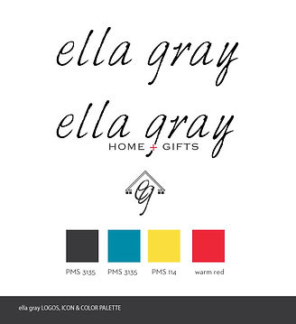
Susan also developed an icon to be used in conjunction with the logo or on it's own. The final color palette is also shown.
ELLA GRAY logo
FIRST + FIR wine
April, the owner, wanted to create her own specialty products to sell in Ella Gray under the name FIRST + FIR. Which are the cross streets of Ella Gray. The logo incorporates the + sign from the Ella Gray logo to tie them together. The black and white sketches on the wine label are inspired from the globe chandeliers hanging in the atrium of Ella Gray, which were designed by April.
